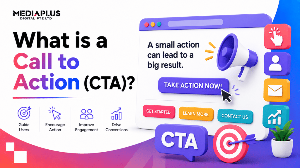
A call to action, or CTA, is a prompt that tells someone what to do next and encourages them to do it now. It usually takes the form of a button or link with a short instruction such as “Start free trial”, “Get a quote” or “Add to cart”. Every CTA points a reader toward one specific action, whether that is buying, subscribing, downloading or booking a call.
CTAs are small, but they carry a lot of weight. A page can have brilliant copy, sharp design and a genuinely good offer, and still fail if the reader reaches the end and does not know what to do. The CTA closes that gap. It turns passive attention into a measurable action.
This guide covers what a CTA is, where CTAs appear, the different types by funnel stage, the anatomy of one that converts, weak-versus-strong examples you can copy, the mistakes that quietly cost you sales, and how to test your CTAs properly.
Why CTAs matter
A CTA is the bridge between interest and action. Without a clear one, you are relying on visitors to work out the next step themselves, and most will not bother. They leave, and the intent you worked hard to build evaporates.
Done well, a CTA does three jobs at once. It sets a single, obvious next step. It reduces the mental effort of deciding. And it gives you something concrete to measure, because clicks and conversions on a defined action are trackable in a way that “engagement” is not.
The numbers back this up. HubSpot analysed more than 330,000 calls to action and found that personalised CTAs, ones tailored to where the visitor is in their journey, performed 202% better than generic versions (HubSpot, 2019). Email tells a similar story: campaigns built around a single CTA can lift clicks dramatically compared with cluttered messages that ask for several things at once (WordStream, 2022). The pattern is consistent. Clarity and focus beat volume.
Where CTAs appear
CTAs live almost everywhere a brand asks something of an audience. The wording and format shift with the channel, but the purpose stays the same.
- Websites. Header buttons (“Book a consultation”), inline links inside blog posts, and sticky bars that follow the reader down the page.
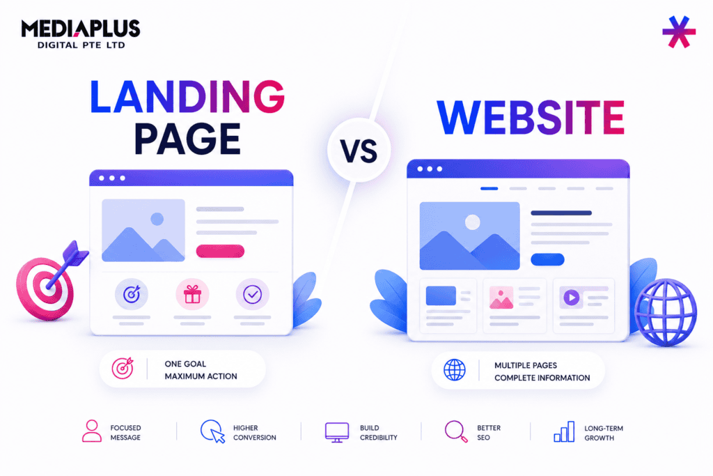
- Landing pages. The single most CTA-dependent asset you own. A dedicated landing page exists to drive one action, so its CTA does the heavy lifting.
- Ads. Google and Meta ads pair a headline with a CTA button such as “Shop now”, “Learn more” or “Sign up”.
- Email. A newsletter or nurture email usually ends on one primary button that carries the click through to a page.
- Social media. Captions close with prompts like “Link in bio”, “Tap to shop” or “DM us to start”.
- Product and category pages. “Add to cart” and “Buy now” are CTAs doing quiet, high-volume work on every ecommerce store.
The takeaway: a CTA is not one button on one page. It is a system of prompts across every touchpoint, each one moving the reader a step closer.
Types of CTA by funnel stage
Not every visitor is ready to buy. Someone reading a blog post for the first time needs a very different ask from someone comparing your pricing page for the third time. Matching the CTA to the funnel stage is what separates a prompt that feels helpful from one that feels pushy.
Marketers usually split the journey into three stages: top of funnel (TOFU), middle of funnel (MOFU) and bottom of funnel (BOFU).
|
Funnel stage |
Visitor mindset |
Goal of the CTA |
Example CTA copy |
|
Top (TOFU) |
Just discovering, low commitment |
Keep them engaged, capture a light lead |
“Read the guide”, “Download the free checklist”, “Subscribe for weekly tips” |
|
Middle (MOFU) |
Comparing options, evaluating |
Build trust, deepen the relationship |
“Watch the demo”, “See case studies”, “Compare plans” |
|
Bottom (BOFU) |
Ready to decide |
Convert to a sale or qualified enquiry |
“Start free trial”, “Get a quote”, “Book a call”, “Buy now” |
A common mistake is pushing a BOFU ask (“Buy now”) on a TOFU reader who has known your brand for ninety seconds. It converts poorly because the request outpaces the trust. Offer that same reader a free checklist instead, and you earn the email address that lets you nurture them toward the sale later.
Anatomy of a high-converting CTA
A strong CTA is the sum of several parts working together. Change one and you can move the conversion rate. Here is what to get right.
Copy
Lead with a verb and make the value obvious. “Get my free audit” beats “Submit” because it tells the reader exactly what happens and what they gain. Write from the reader’s point of view where you can. First-person phrasing (“Start my trial”) often outperforms second-person (“Start your trial”) because it reads like the user’s own decision.
Design
The button has to look clickable and stand out. That means enough size to tap comfortably on mobile, generous padding, and a shape that reads as a button rather than a banner. CTA buttons consistently outperform plain text links, especially on phones, so give the primary action a real button.
Placement
Put the CTA where intent peaks. For a short landing page, that is above the fold and again at the bottom. For a long sales page, repeat it at natural decision points so the reader never has to scroll back to act. The rule of thumb: the moment someone is convinced, the button should be within reach.
Colour and contrast
Colour matters less than contrast. There is no single “best” button colour. What works is a colour that stands apart from everything around it, so the eye lands on it instantly. This is where visual hierarchy does the work: the CTA should be the most visually dominant element in its section. If it blends in, it gets missed.
Urgency and friction
A light nudge toward acting now helps, provided it is honest. “Only 3 seats left” or “Offer ends Friday” works when true and backfires when invented. Just as important is reducing friction around the button: a line of reassurance underneath (“No card required. Cancel anytime.”) removes the last hesitation before the click.
Weak versus strong CTA examples
Most weak CTAs are not wrong, they are just vague. They describe a mechanism (“Submit”) instead of an outcome. Strong CTAs name the value and speak in the reader’s voice. Here is the difference side by side.
|
Context |
Weak CTA |
Strong CTA |
Why the strong one wins |
|
SaaS signup |
“Submit” |
“Start my free 14-day trial” |
Names the offer and removes risk |
|
Ecommerce product |
“Continue” |
“Add to cart” |
Clear, expected, action-specific |
|
Lead magnet |
“Download” |
“Get the free CRO checklist” |
States exactly what they receive |
|
Consultation |
“Contact us” |
“Book my free strategy call” |
Specific action, low commitment, first-person |
|
Newsletter |
“Sign up” |
“Send me weekly marketing tips” |
Sets the value and frequency |
|
Pricing page |
“Learn more” |
“See plans and pricing” |
Matches the intent of the reader |
Button copy you can borrow
Short, verb-led and specific wins. Some patterns that tend to perform:
- “Get my free quote”
- “Start free trial”
- “Book a call”
- “Show me the pricing”
- “Claim my discount”
- “Send me the guide”
- “Add to cart”
- “Reserve my spot”
Avoid dead words like “Submit”, “Enter” and “Click here”. They add zero value and often add friction.
Common CTA mistakes
Even experienced teams trip over the same few issues. Watch for these.
- Too many CTAs competing. When a page offers five equally weighted actions, the reader picks none. Choose one primary CTA per page and demote the rest to secondary links.
- Vague copy. “Learn more” everywhere. It is safe, forgettable and tells the reader nothing about what happens next.
- Poor contrast. A button that matches the background colour or sits in a busy section simply disappears.
- Mismatched offer. Asking for a sale when the reader wanted information. The CTA has to fit the funnel stage.
- Hiding the button. Burying the primary action below three scrolls of copy with no repeat.
- No mobile thought. Tiny tap targets and buttons crammed against other links. More than half of web traffic is mobile, so the phone view is not an afterthought.
- Broken promises. A button that says “Free trial” leading to a page that demands a credit card. Trust breaks, and the next click never comes.
How to test your CTAs
You do not have to guess which CTA works. You test it. A/B testing (also called split testing) shows two versions of a CTA to comparable groups of visitors and measures which one drives more of the action you want.
A simple, reliable process:
- Pick one variable. Test the copy, or the colour, or the placement. Change one thing at a time, or you will not know what caused the result.
- Form a hypothesis. For example: “Changing ‘Submit’ to ‘Get my free quote’ will lift form completions because it names the value.”
- Split the traffic. Send half your visitors to version A and half to version B.
- Wait for significance. Let the test run until you have enough conversions to trust the result, not just a day or two.
- Ship the winner, then test again. CRO is iterative. The winning CTA becomes your new baseline for the next test.
Good things to test first, in rough order of impact: the copy (usually the biggest lever), the placement, then contrast and colour, then supporting microcopy under the button. If you want a structured starting point, our CRO checklist walks through the highest-impact elements to review before you launch a test.
CTAs and conversion rate optimisation
A CTA is not a standalone trick. It is one component of conversion rate optimisation, the practice of increasing the share of visitors who take a desired action. CRO looks at the whole path: the headline that sets expectations, the web design principles that make a page easy to scan, the proof that builds trust, and the CTA that captures the decision.
The CTA is where all of that either pays off or does not. Improve the surrounding experience and a good CTA converts more. Improve the CTA and everything upstream works harder. For ecommerce stores in particular, small changes to “Add to cart” and checkout CTAs compound across thousands of sessions, which is why they feature heavily in any serious plan to increase sales on your ecommerce site.
Frequently asked questions
What does CTA stand for?
CTA stands for “call to action”. It is any prompt (button, link or line of copy) that asks the reader to take a specific next step, such as buying, signing up or getting in touch.
What is a good example of a CTA?
Anything specific and value-led. “Start my free trial”, “Get a free quote” and “Download the checklist” are all strong because they tell the reader exactly what they get. Weak examples like “Submit” or “Click here” describe a mechanism, not a benefit.
Where should I place a CTA on a page?
Wherever the reader’s intent peaks. On a short page, that is usually above the fold and again at the end. On a long page, repeat the CTA at natural decision points so the reader can act the moment they are convinced.
How many CTAs should a page have?
One primary CTA per page. You can repeat that same primary action several times, and you can offer secondary links, but the main ask should be singular. Competing CTAs of equal weight split attention and lower conversions.
Does the colour of a CTA button matter?
Contrast matters more than the specific colour. There is no universally best button colour. The right choice is one that stands out clearly from its surroundings so the reader spots it immediately. Test colour once contrast and copy are sorted.
What is the difference between a CTA and a button?
A button is one format a CTA can take. The CTA is the instruction and its intent (“Book a call”); the button is simply how you present it. A CTA can also be a text link, an image or a line in an email.
How do I know if my CTA is working?
Measure its click-through rate and the conversion rate of the action it drives, then run A/B tests to improve them. If a change lifts conversions at statistical significance, keep it and test the next element.
Turn attention into action
A CTA is small, but it is the moment your marketing either earns a result or does not. Get the copy specific, the design clear, the placement right and the offer matched to the reader, then test and refine.
If you would rather have that handled properly, MediaPlus Digital builds and optimises the pages where CTAs do the work. Explore our conversion rate optimisation and web design and development services, and let’s turn more of your traffic into customers.