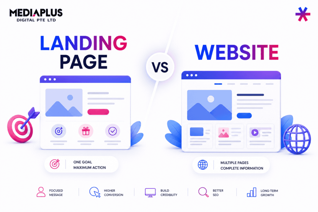
A well-designed website does more than just look good. It guides users, builds trust, and turns visitors into customers.
In today’s competitive digital landscape, especially in markets like Australia, users expect websites to be fast, intuitive, and visually clear. If your design feels confusing or cluttered, most people will leave within seconds.
That’s why understanding web design principles is so important. These principles are not trends or personal preferences. They are based on how people naturally see, scan, and interact with content.
When applied correctly, they help you create websites that are not only attractive but also effective.
What Are Web Design Principles?
Web design principles are a set of fundamental guidelines used to organise visual elements in a way that improves usability and communication.
They help answer key questions like:
-
Where should users look first?
-
What action should they take?
-
How easily can they navigate the page?
Instead of guessing, these principles give you a structured approach to designing better user experiences.
10 Core Web Design Principles Explained
1. Proximity
Proximity refers to how elements are grouped together.
When related items are placed close to each other, users can quickly understand their relationship. For example, a headline placed near its description feels connected, while too much spacing can make content feel disconnected.
Good use of proximity reduces confusion and improves readability.
2. Fitts’s Law
Fitts’s Law states that the larger and closer a clickable element is, the easier it is to interact with.
In practice, this means:
-
Buttons should be large enough to tap on mobile
-
Important actions should be easy to reach
-
Clickable areas should not require precision
Ignoring this principle often leads to poor user experience and lower conversion rates.
3. Emphasis (Visual Hierarchy)
Every page should have a clear focal point.
Users should instantly know:
-
What is most important
-
Where to look first
-
What to do next
This is achieved through size, contrast, color, and positioning. Without emphasis, everything looks equally important, and users don’t know where to focus.
4. White Space (Negative Space)
White space is the empty area around elements, and it plays a crucial role in design.
It helps:
-
Make content easier to read
-
Highlight important sections
-
Create a clean and professional look
Too little white space creates clutter. Too much, if used incorrectly, can feel empty. The key is balance.
5. Color Palette
Color defines the personality of your website.
A strong color palette:
-
Builds brand recognition
-
Creates emotional impact
-
Guides user attention
Most effective websites use a limited palette with one primary color and one or two accent colors to maintain clarity and consistency.
6. Basic Layout Elements
Every website layout is built from three simple components:
-
Dots (points of attention like buttons)
-
Lines (navigation or separators)
-
Rectangles (content blocks)
Understanding these basics helps you structure pages more effectively and avoid unnecessary complexity.
7. Consistency
Consistency ensures that your website feels cohesive.
This includes:
-
Using the same button styles
-
Keeping font sizes uniform
-
Maintaining consistent spacing and colors
Inconsistent design makes a website feel unprofessional and harder to use.
8. Modularity (Grid System)
Modularity means designing layouts using structured blocks aligned to a grid.
This approach:
-
Keeps layouts clean and organised
-
Improves readability
-
Makes scaling and updates easier
Most modern websites rely on grid systems to maintain balance and alignment.
9. Anchor Objects
Anchor objects are the main visual elements that attract attention.
These could be:
-
A headline
-
A hero image
-
A call-to-action button
Placing them strategically helps guide users through the page and creates a strong visual structure.
10. Z-Pattern & F-Pattern
Users don’t read websites word by word. They scan them.
Two common scanning patterns are:
-
F-pattern: Used for text-heavy pages like blogs
-
Z-pattern: Used for landing pages and marketing content
Designing with these patterns in mind helps guide users naturally toward key information and actions.
Turning Design Principles into Real Results
Understanding these principles is a great starting point, but applying them effectively requires experience.
Many businesses struggle because they focus only on visuals without considering performance. A website might look modern but still fail to convert.
That’s why agencies like Mediaplus Digital Australia take a more practical approach. Instead of treating design as a standalone task, they connect it with real business outcomes.
This often includes:
-
Web Design & Development to ensure layouts are both visually appealing and technically strong
-
Landing Page Development to apply hierarchy and user flow principles for higher conversions
-
Website Maintenance Services to keep the design consistent, updated, and performing over time
By combining design principles with execution, businesses can move beyond theory and achieve measurable growth.
Final Thoughts
Web design principles are the foundation of every effective website.
They help you:
-
Communicate clearly
-
Guide user behaviour
-
Improve usability
-
Increase conversions
But the real value comes from how you apply them.
In today’s digital environment, the most successful websites are not just well-designed. They are strategically built, continuously optimised, and aligned with business goals from the start.