
Quick answer: A good website is clear about what it offers within five seconds, loads its main content in under 2.5 seconds, works one handed on a phone, and converts a measurable share of visitors into enquiries. The eight qualities below each have a number attached, so you can test your own site instead of guessing.
Search this question and you get a lot of lists. Seven qualities. Ten essential features. Thirteen must haves. They are mostly correct and mostly useless, because they stop at “your site should be fast” without telling you what fast means.
This guide keeps the list format, then attaches a measurable standard to each quality and finishes with a scorecard. If your site scores badly on something, you will know exactly which number you missed.
For the separate question of what a site needs to contain, see what should a business website include.
1. It is instantly clear
The quality. A first time visitor understands what you do, who it is for, and what to do next, without scrolling and without effort.
How to measure it. The five second test. Show your homepage to someone outside your industry for five seconds, hide it, then ask what the business does, who it serves, and what they would do next.
The standard: all three answered correctly.
Most business homepages fail because they lead with a slogan. “Transforming possibilities into outcomes” communicates nothing. “Commercial air conditioning installation and service across Melbourne” communicates everything. Say the plain thing.
2. It loads fast on a real phone
The quality. The page appears quickly on mobile data, not just on office wifi.
How to measure it. Google’s Core Web Vitals, checked in Search Console using real visitor data rather than a lab test.
|
Metric |
What it measures |
Standard |
|
Largest Contentful Paint |
Time until main content appears |
Under 2.5 seconds |
|
Interaction to Next Paint |
Responsiveness to taps |
Under 200 milliseconds |
|
Cumulative Layout Shift |
How much the page jumps while loading |
Under 0.1 |
The usual culprits on Australian business sites are uncompressed hero images, background video, too many web fonts, and page builder plugins loading scripts everywhere. Our explainer on Core Web Vitals covers the fixes.
3. It works one handed on mobile
The quality. Someone on a phone, possibly walking, can use the site without pinching, zooming or switching hands.
How to measure it. Complete an enquiry on your own site, on your own phone, using one thumb.
The standard: under 60 seconds, no zooming, no horizontal scrolling.
Check specifically: tap targets at least 44 pixels with space between them, body text at 16 pixels minimum, phone numbers as tap-to-call links rather than plain text, forms that open the right keyboard, and no popup covering the screen before anything has been read. Our guides to responsive web design and mobile first design cover the principles.
4. It converts visitors into enquiries
The quality. Traffic turns into contact. This is the quality that pays for the site.
How to measure it. Conversion rate, tracked in analytics, with a defined conversion event.
|
Site type |
Typical range |
|
Local service business |
2% to 8% enquire |
|
B2B lead generation |
1% to 5% |
|
Ecommerce |
1% to 3% purchase |
|
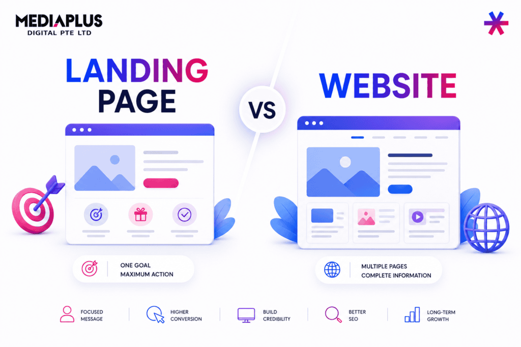
Landing page with matched traffic |
5% to 15% |
The standard: you know your number, and it is improving.
Treat those ranges as orientation rather than targets, because they vary hugely by traffic source. Your own trend matters more. If traffic is healthy and enquiries are flat, the problem is the website, not the marketing, and that is what conversion rate optimisation addresses.
Also watch the gap between mobile and desktop conversion. A large gap almost always means a mobile design problem rather than a mobile audience problem.
5. The content is specific and scannable
The quality. Visitors get the point from skimming, and the words say something a competitor could not copy verbatim.
How to measure it. Read only your headings, top to bottom. Then count the unsupported claims.
The standard: headings alone convey the offer and the next step. Every claim has a number, a name or a date attached.
“Fast turnaround” is filler. “Installed in four to six weeks” is content. “Trusted by many clients” is filler. “Over 1,200 installs across Melbourne since 2014” is content. Aim for language a Year 8 student could follow, because jargon loses people who are qualified to buy but not qualified in your field.
6. It is accessible
The quality. People using screen readers, keyboards or larger text can still use the site. This widens your audience and reduces legal exposure, since the Disability Discrimination Act has been applied to websites.
How to measure it. WCAG 2.1 AA, checked with WAVE, axe DevTools or Lighthouse.
|
Check |
Standard |
|
Text contrast |
At least 4.5:1 |
|
Large text contrast |
At least 3:1 |
|
Keyboard navigation |
Every function reachable without a mouse |
|
Focus indicator |
Visible when tabbing |
|
Alt text |
On every meaningful image |
|
Heading order |
One H1, then H2 and H3 nested correctly |
|
Form labels |
Real labels, not placeholder text |
|
Text resize |
Usable at 200% |
Light grey text on white is the most common failure, and it is nearly always a deliberate design choice.
7. It is credible
The quality. A sceptical stranger can satisfy themselves that you are a real business that will still exist next year.
How to measure it. Hand your site to someone who has never heard of you and time how long verification takes.
The standard: under one minute.
What does the work: contact details visible without hunting, a real address or at least a suburb, ABN in the footer, licence and registration numbers where your trade requires them, live Google reviews rather than typed testimonials, real photographs of real people, and specific figures rather than adjectives.
One exception worth knowing: registered health practitioners cannot use patient testimonials in their own advertising under the National Law, so embedded reviews are not available to them.
8. It can be found
The quality. The site is visible in search for the things you sell, not just for your business name.
How to measure it. Search site:yourdomain.com.au in Google and check the indexed page count looks right. Then check you have a separate page for each service you want to rank for.
The standard: indexed, HTTPS everywhere, one page per service, unique page titles, internal links between related pages.
The most common structural failure is a single “Services” page listing eight offerings. It ranks for none of them. Our SEO checklist covers the wider audit and what SEO is covers the fundamentals.
The scorecard
Score each quality out of 5 against the standard above.
|
Quality |
Standard |
Score |
|
1. Clear |
Passes the five second test |
/5 |
|
2. Fast |
LCP under 2.5s on mobile data |
/5 |
|
3. Mobile |
Enquiry completed one handed under 60s |
/5 |
|
4. Converting |
Rate known, tracked, improving |
/5 |
|
5. Specific |
Headings carry the message, claims have numbers |
/5 |
|
6. Accessible |
Contrast 4.5:1, keyboard navigable |
/5 |
|
7. Credible |
Verifiable as real in under a minute |
/5 |
|
8. Findable |
Indexed, one page per service |
/5 |
32 to 40: in good shape. Focus on conversion refinement. 20 to 31: functional with clear gaps. Fix your two lowest scores first. Under 20: a rebuild will likely cost less than patching.
What does not make a website good
Worth stating plainly, because these absorb most of the internal debate:
- Whether you like the colours. You are not the audience
- How it looks on your desktop monitor. Most visitors are on a phone
- Whether it looks “modern”. Trends age, clarity does not
- Animation and scroll effects. Usually cost speed, rarely add conversions
- Page count. Fifteen good pages beat sixty thin ones
- Design awards
Our list of website design mistakes covers the traps, and essential web design principles covers the thinking behind good outcomes.
Frequently asked questions
What are the qualities of a good website?
Clarity, speed, mobile usability, conversion, specific content, accessibility, credibility and findability. The eight above, each with a measurable standard.
What are the 7 C’s of a website?
A marketing framework usually listed as context, content, community, customisation, communication, connection and commerce. It is a useful planning lens but not a diagnostic, which is why the measurable standards above are more practical for judging an existing site.
What are the 5 most important things on a website?
Clear description of what you do, visible contact details, individual service pages, proof you are legitimate, and one obvious next step on every page.
How fast should a website load?
Largest Contentful Paint under 2.5 seconds on mobile data. Over 4 seconds needs immediate attention.
What is a good conversion rate for a business website?
Local service businesses commonly see 2% to 8% of visitors enquire, ecommerce 1% to 3%. Your own trend matters more than the benchmark.
Should I redesign or improve my current site?
Score it above. Under 20, rebuild. Between 20 and 31, targeted fixes usually cost less and deliver more.
Where to start
Run the scorecard honestly, ideally with someone who does not work in your business. Most Australian sites lose the most points on speed, mobile usability and conversion tracking, and all three are fixable without a rebuild.
If traffic is healthy but enquiries are not, our conversion rate optimisation team works on exactly that gap. For a full rebuild, our web design and development team can help. Get in touch and we will score your site against this list.