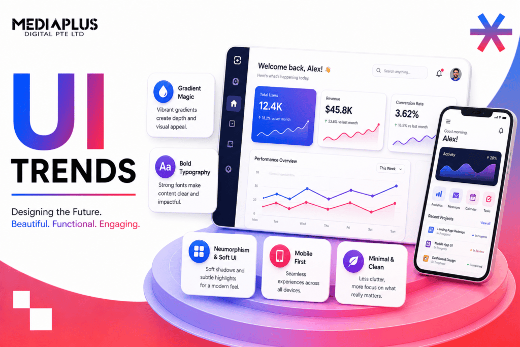
The mood of interface design has shifted. After a few years of maximalism, heavy animation, and pages that tried to impress before they tried to work, 2026 is quieter and more deliberate. The best interfaces this year feel calm, load fast, adapt to the person using them, and treat accessibility as a starting point rather than a final audit.
Part of that shift is practical. Generative AI is now embedded in how products are designed and how they behave once shipped. According to the Figma State of the Designer 2026 report, 72% of designers now use generative AI in their work, and 91% say it improves the quality of what they ship. When the tooling changes this quickly, the patterns on screen change with it.
This guide covers 13 UI trends worth paying attention to in 2026. For each one you get a short definition, why it matters for your business, and a concrete way to apply it, whether that is a CSS technique, a component pattern, or a design decision. We have grouped them into four themes: AI and personalisation, layout and visual, motion and interaction, and the foundational trends that hold everything together.
What is changing in 2026
Three forces are pulling interface design in the same direction.
- AI moved from novelty to plumbing. It writes copy, generates layouts, and now sits inside products as a working feature. Users expect it to help without taking over.
- Performance is a ranking factor and a conversion factor. Google’s Core Web Vitals reward pages that load quickly and respond to input without lag, so heavy visual trends have to earn their weight.
- Accessibility is becoming law, not just good practice. The EU’s European Accessibility Act brought new obligations into force from June 2025, and regulators elsewhere are following. Designing for the estimated 1.3 billion people who live with a significant disability (World Health Organization) is now a baseline expectation.
The through-line: restraint. Trends that add clarity are winning. Trends that add noise are being trimmed back.
Why UI trends matter for your business
Trends are not about chasing novelty. A well-chosen interface pattern reduces friction, and reduced friction shows up in the numbers that matter: time on page, task completion, sign-ups, and sales.
The interface is also where trust is built or lost in the first few seconds. A cluttered, slow, or confusing screen tells visitors your product might be the same. A clear one does the opposite. That is why UI decisions belong in the same conversation as your web design and development strategy rather than being treated as a coat of paint applied at the end.
The 2026 UI trends at a glance
|
Trend |
What it is |
How to apply it |
|
AI as a transparent copilot |
AI that assists and shows its reasoning, without taking control |
Side panels with accept, edit, reject actions and a visible source |
|
Personalised, adaptive interfaces |
Layouts that adjust to the user and context |
Swap content blocks for returning vs new visitors; keep a stable core |
|
Calm, intentional minimalism |
One clear job per screen |
Single primary action, generous white space, obvious defaults |
|
Bento grids |
Modular card layouts with mixed spans |
CSS Grid with grid-column: span cards replacing carousels |
|
Big, fluid typography |
Large, responsive, variable-font headings |
clamp() for type; variable fonts for weight control |
|
Dark mode as standard |
Both themes shipped from day one |
Design tokens plus prefers-color-scheme |
|
Glassmorphism and liquid glass |
Frosted, translucent surfaces |
backdrop-filter: blur() with contrast checks |
|
Purposeful micro-interactions |
Motion that explains state |
Feedback on hover, load, success, and error |
|
Accessible, reduced motion |
Animation that respects user settings |
Honour prefers-reduced-motion; add an in-UI toggle |
|
3D and spatial UI |
Interactive 3D, product configurators, AR previews |
WebGL with lazy loading and a performance budget |
|
Multimodal and voice input |
Voice, gesture, and text as options |
Add voice where hands-free helps; keep a visible fallback |
|
Accessibility-first design |
WCAG built in from the wireframe |
Semantic HTML, 4.5:1 contrast, visible focus states |
|
Bold colour and neo-brutalism |
Raw, high-personality visual style |
Strong palettes and blunt layouts, kept legible |
AI and personalisation trends
1. AI as a transparent copilot, not an autopilot
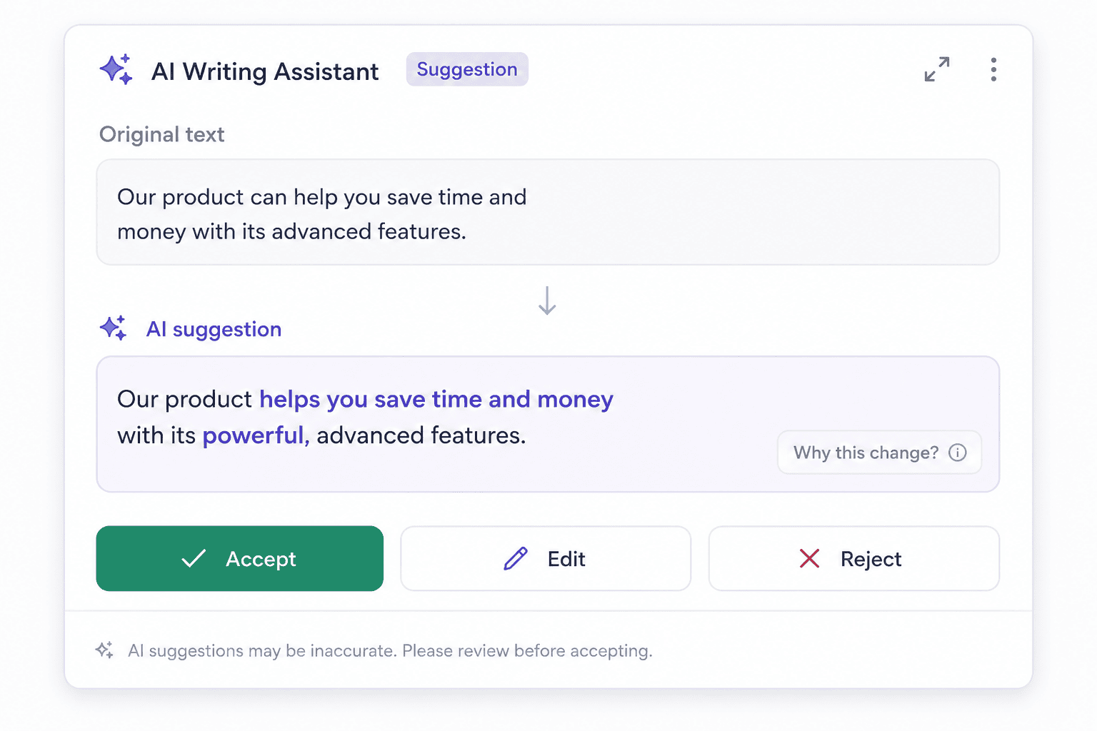
What it is. AI features that assist inside a product while keeping the person in charge. Think of a writing tool that suggests an edit and lets you accept or reject it, rather than silently rewriting your work.
Why it matters. Trust is the constraint on AI adoption. Users accept AI help when they can see what it did and undo it. They abandon tools that feel like they have lost control.
How to apply it. Put AI in a side panel or an inline suggestion, not in charge of the whole screen. Show three clear actions on any AI output: accept, edit, reject. Where the AI made a claim or a change, show its source or a short confidence signal so the user can judge it. Notion and GitHub Copilot both follow this pattern, offering suggestions the user confirms rather than changes that happen automatically.
2. Personalised and adaptive interfaces
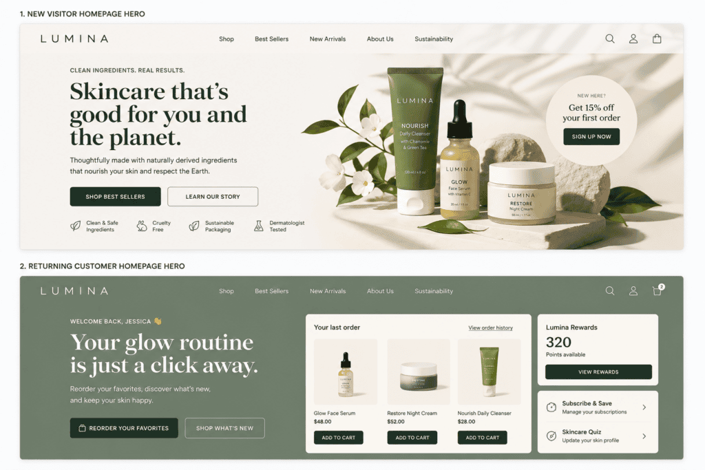
What it is. Interfaces that reshape themselves based on who is using them and in what context. A returning customer sees their reorder shortcuts; a first-time visitor sees an explainer.
Why it matters. Relevance lifts engagement. When the screen anticipates the next step, the user does less work to reach it.
How to apply it. Identify two or three visitor states that actually change intent (new vs returning, logged in vs anonymous, location, past purchase). Swap specific content blocks for those states while keeping the core layout stable, so the product still feels familiar. Use progressive disclosure to reveal advanced options only when needed. This matters most for ecommerce web design and development, where a personalised home feed can be the difference between a bounce and a basket. Amazon’s recommendation-driven layout is the reference example, but the principle scales down to a small store with a handful of adaptive blocks.
3. Calm UI and intentional minimalism
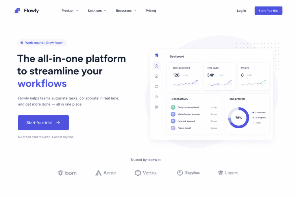
What it is. A deliberate reduction of everything competing for attention, so each screen has one obvious job.
Why it matters. Every extra button, banner, and pop-up costs a fraction of the user’s attention. Calm interfaces convert because the next step is never in doubt. This is visual hierarchy applied with discipline.
How to apply it. Give each screen a single primary action and demote everything else to secondary styling. Use white space as a structural tool, not leftover margin. Set sensible defaults so users can move forward without deciding everything. Stripe’s dashboards are a long-running example of this restraint.
Layout and visual trends
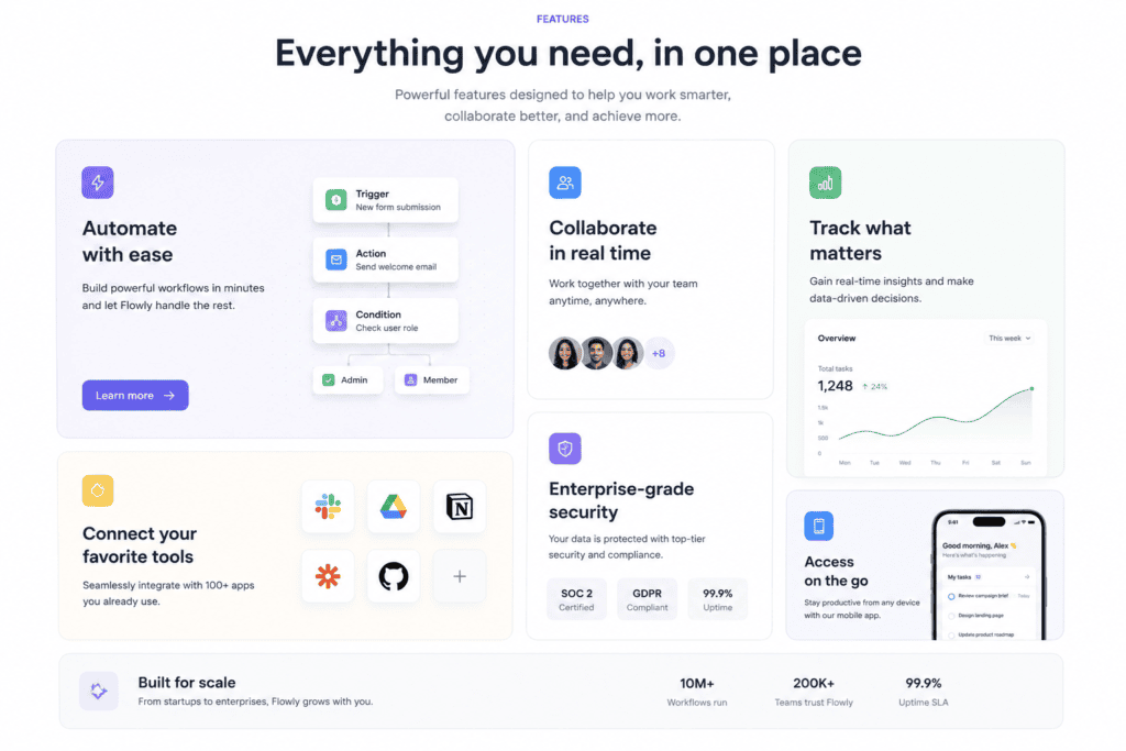
4. Bento grids and modular layouts
What it is. A layout built from cards of different sizes arranged in a grid, named after the compartments of a Japanese bento box. It lets you show many things at once without a wall of uniform tiles.
Why it matters. Bento grids are replacing carousels, and the data supports the switch. Yale University’s usability research found only around 1% of users click a carousel at all, and 89% of those clicks land on the first slide. Content hidden on slides two and beyond is effectively invisible. A bento grid puts everything in view.
How to apply it. Use CSS Grid with cards that span different numbers of columns and rows.
.bento {
display: grid;
grid-template-columns: repeat(4, 1fr);
gap: 1rem;
}
.bento .feature { grid-column: span 2; grid-row: span 2; }
.bento .wide { grid-column: span 2; }
Apple’s product pages popularised the look. Keep the most important card largest, and make sure the grid reflows to a single column on mobile.
5. Big, bold, fluid typography
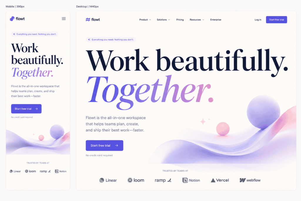
What it is. Large, expressive headings that scale smoothly across screen sizes, often using variable fonts for fine control over weight and width.
Why it matters. Type is the cheapest way to build hierarchy and personality. Fluid type removes the awkward jumps between fixed breakpoints, so a heading looks right on every device.
How to apply it. Use clamp() to set a minimum, preferred, and maximum size in one line.
h1 { font-size: clamp(2rem, 5vw + 1rem, 4.5rem); }
Pair it with a variable font so you can dial weight to taste without loading five font files. This ties directly into responsive web design best practices, since fluid type is responsive by construction.
6. Dark mode as standard
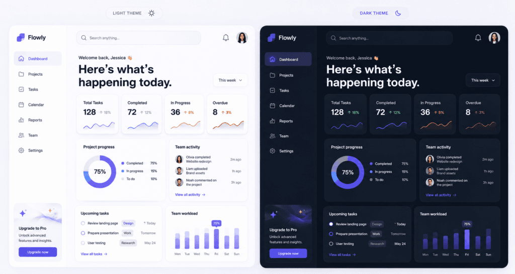
What it is. Shipping a light and a dark theme together, and respecting the user’s system setting rather than forcing one look.
Why it matters. Dark mode is now an expectation, not a feature. Users notice its absence. Done well, it reduces eye strain in low light and can save battery on OLED screens.
How to apply it. Build with design tokens (CSS custom properties) for colour so you flip a theme by swapping variable values, not by rewriting components. Detect the system preference with prefers-color-scheme.
:root { –bg: #ffffff; –text: #111827; }
@media (prefers-color-scheme: dark) {
:root { –bg: #0b0f19; –text: #e5e7eb; }
}
Check contrast in both themes. A palette that passes in light mode can fail in dark mode.
7. Glassmorphism and liquid glass
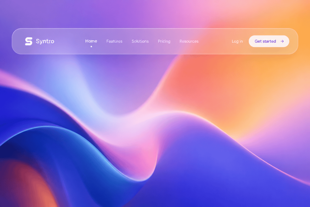
What it is. Translucent, frosted surfaces that let background colour and shape show through, giving depth and a sense of layered materials. Apple leaned into this with the liquid glass direction in iOS 26.
Why it matters. Used sparingly it adds hierarchy and a premium feel to navigation bars, cards, and modals.
How to apply it. The core technique is one line.
.glass {
background: rgba(255, 255, 255, 0.15);
backdrop-filter: blur(12px);
border: 1px solid rgba(255, 255, 255, 0.2);
}
The watch-out is legibility. Text over a blurred, semi-transparent surface can easily drop below the 4.5:1 contrast ratio. Test every glass surface with real content behind it, and add a solid fallback where contrast fails.
Motion and interaction trends
8. Purposeful micro-interactions
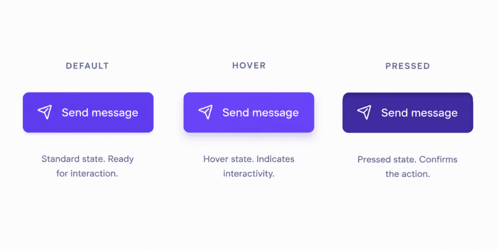
What it is. Small, functional animations that confirm what just happened: a button that depresses, a toggle that slides, a field that shakes when input is invalid.
Why it matters. Motion that explains reduces uncertainty. The user knows their tap registered, their save worked, or their form has an error. The 2026 rule is motion that explains, not motion that performs.
How to apply it. Attach animation to state changes: hover, focus, loading, success, and error. Keep durations short (150 to 300ms) and use easing that feels physical. Give every interactive element a clear pressed and disabled state. Avoid decorative motion that fires on scroll for no reason, because it competes with content and can hurt your Core Web Vitals, especially Interaction to Next Paint (INP), when it runs heavy scripts on the main thread.
9. Accessible and reduced motion
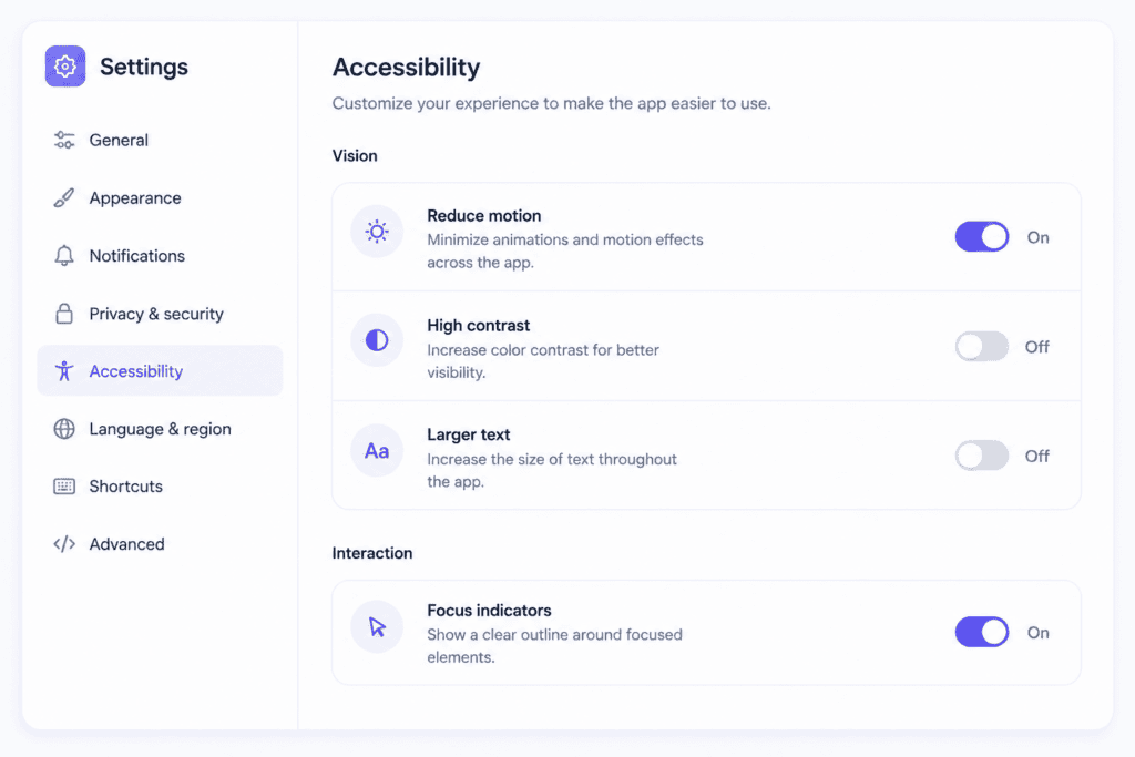
What it is. Treating animation as optional. Some users get dizzy or nauseous from motion, so the interface should tone it down when asked.
Why it matters. Beyond comfort, it is an accessibility requirement and, increasingly, a compliance one under WCAG 2.2.
How to apply it. Honour the prefers-reduced-motion media query, and offer an in-product toggle for users whose system setting does not reflect their preference in the moment.
@media (prefers-reduced-motion: reduce) {
* { animation: none !important; transition: none !important; }
}
Replace large movement with a simple fade, and never tie essential information to an animation the user cannot see.
10. 3D and spatial UI
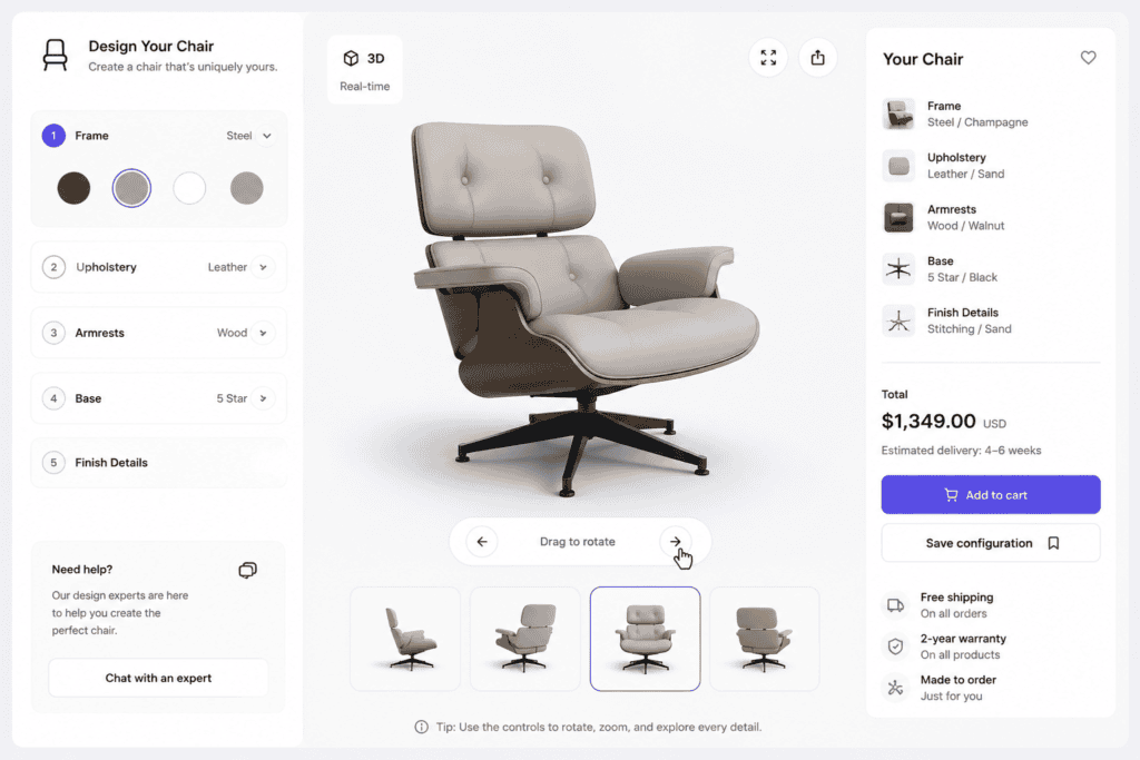
What it is. Interactive three-dimensional elements: product configurators you can rotate, spatial scenes, and augmented reality previews that place a product in the user’s room.
Why it matters. For furniture, fashion, and physical goods, letting people inspect a product in 3D or AR reduces uncertainty before purchase. It is one of the more compelling reasons to invest in richer ecommerce experiences.
How to apply it. Build 3D with WebGL (libraries like Three.js sit on top of it). The hard part is performance. Lazy-load 3D assets so they never block the first paint, set a strict file-size budget for models and textures, and show a lightweight image placeholder until the user opts in. IKEA’s Place app is the well-known AR reference. Measure the impact on Largest Contentful Paint (LCP) and hold the line if a scene is too heavy.
11. Multimodal, voice, and gesture input
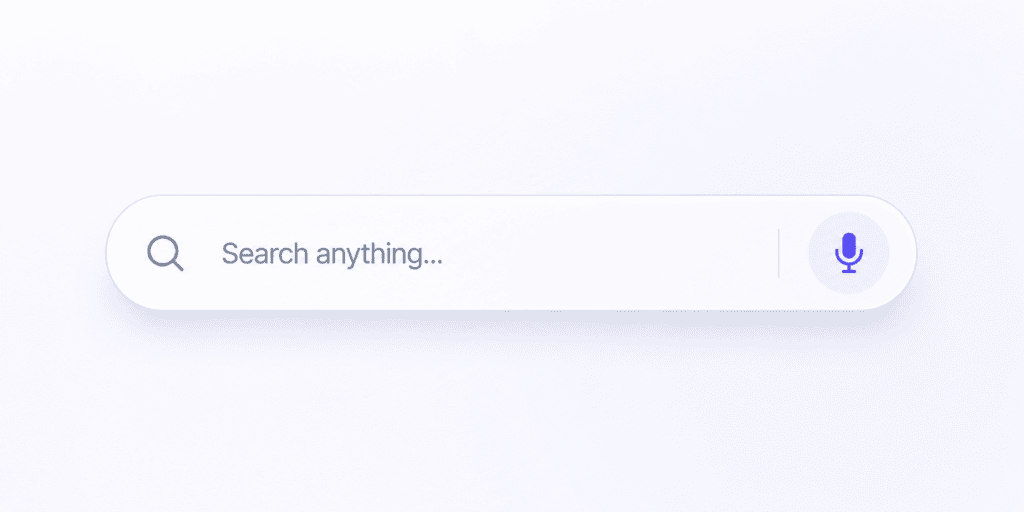
What it is. Interfaces that accept more than clicks and taps: voice commands, gestures, and text, sometimes called Zero UI because the interface recedes.
Why it matters. In hands-free or accessibility contexts, voice and gesture can be faster and more inclusive than a touch target. They widen who can use your product and when.
How to apply it. Add voice input where it genuinely helps, such as search or dictation, and always keep a visible manual fallback so the feature never becomes a dead end. Use the Web Speech API for browser voice input. Treat these inputs as an addition to a solid visual interface, not a replacement for one.
Foundational trends
These are less about visual fashion and more about how well the interface holds up. They are the trends that quietly separate a site that works from one that only looks good in a screenshot.
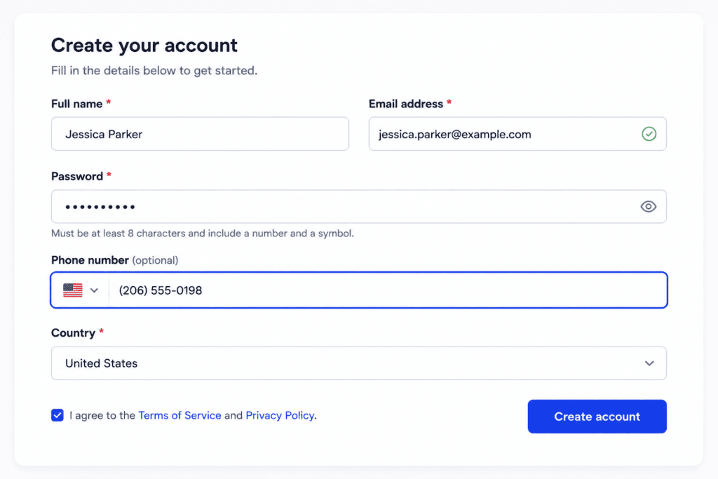
12. Accessibility-first design
What it is. Designing for accessibility from the first wireframe rather than auditing for it at the end. WCAG 2.2 at level AA is the standard to aim for.
Why it matters. Around 1.3 billion people live with a significant disability (World Health Organization), and legislation such as the European Accessibility Act (obligations from June 2025) is turning good practice into legal duty. Accessible interfaces are also better for everyone: clearer contrast, larger targets, and readable text help users on small screens and in bright sunlight too.
How to apply it.
- Use semantic HTML (real buttons, headings, and landmarks) so assistive technology can parse the page.
- Maintain a contrast ratio of at least 4.5:1 for body text.
- Give every interactive element a visible focus state for keyboard users.
- Never rely on colour alone to carry meaning; pair it with text or an icon.
These sit at the heart of the essential web design principles that should guide any build. If you want this handled properly, it is worth working with a team that lists it among their UI and UX web design services.
13. Bold colour, neo-brutalism, and sustainable restraint
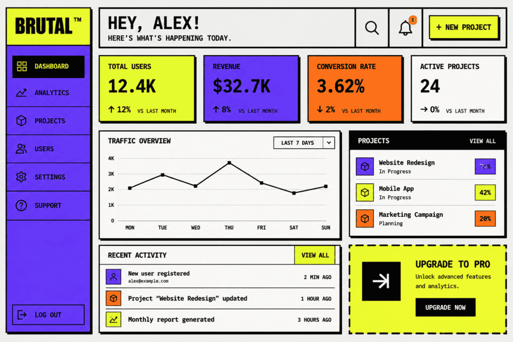
What it is. Two related moves. On the visual side, raw, high-personality styling: neo-brutalist layouts with blunt edges, exposed structure, and loud, confident colour blocks. On the engineering side, a sustainable mindset that ships less code, fewer heavy assets, and system or variable fonts.
Why it matters. Bold colour helps a brand stand out in a sea of safe minimalism, as long as it stays legible. The sustainable side is not just ethics: leaner pages send fewer bytes, which improves load times and Core Web Vitals, and that feeds directly into SEO. Gumroad’s unapologetically bold interface is a good reference for personality done on purpose.
How to apply it. Commit to a strong palette but test every colour pairing for contrast. Compress and lazy-load images, cut unused JavaScript, and prefer system or variable fonts over multiple font files. For a WordPress build, this often means auditing plugins and page builders that quietly bloat the page. A lean WordPress website is faster to load and cheaper to run.
How to choose the right trends for your project
You do not need all 13. Chasing every trend is how sites end up incoherent. Choose the ones that serve your users and your goals.
- Start with the job. What is the one thing a visitor needs to do on this page? Pick trends that make that easier and drop the rest.
- Match the trend to your audience. A B2B SaaS product benefits from calm minimalism and transparent AI. A fashion brand might lean into bold colour and 3D previews.
- Weigh performance every time. Anything visual (glass, 3D, heavy motion) should be checked against Core Web Vitals before it ships. If it slows the page, it needs to justify the cost.
- Never trade away accessibility. Foundational trends are not optional extras. A bold, glassy, animated site that fails a contrast check is a worse site.
- Prototype, then measure. Ship a change, watch the behaviour, and keep what moves the numbers.
If you are refreshing an older site, it helps to look at the wider web design trends and, for online stores, the specific ecommerce web design trends shaping 2026 alongside these interface-level patterns.
Frequently asked questions
What is the difference between UI trends and UX trends?
UI (user interface) is what the user sees and touches: layout, colour, type, buttons, and motion. UX (user experience) is the wider journey and how it feels to complete a task. UI trends like bento grids or glassmorphism are visual and interactive patterns. They serve UX, but they are not the same thing. Good UI supports good UX; it does not guarantee it.
Are UI trends worth following, or should I ignore them?
Follow the ones that solve a real problem for your users and ignore the rest. Trends are useful signals about what people now expect, but adopting a trend for its own sake usually adds clutter. Judge each one against your goals and your audience.
Will AI replace UI designers in 2026?
No, though it is changing the work. The Figma State of the Designer 2026 report found 72% of designers already use generative AI, mostly to speed up production and exploration. It handles repetitive tasks and first drafts, which frees designers to focus on structure, judgement, and the decisions AI cannot make well.
Is glassmorphism accessible?
It can be, but it needs care. Translucent, blurred surfaces often drop text contrast below the WCAG 2.2 minimum of 4.5:1. If you use it, test every glass surface with real content behind it and add a solid fallback where the contrast fails.
How do UI trends affect SEO?
Indirectly but genuinely. Google’s Core Web Vitals reward pages that load fast and respond quickly. Heavy trends (large 3D scenes, excessive motion, uncompressed images) can hurt metrics like LCP and INP, which can affect rankings. Lean, accessible, fast interfaces tend to perform better in search as well as with users.
Should I still use carousels in 2026?
Usually not. Yale University usability research found only around 1% of users click a carousel, and 89% of those clicks land on the first slide. A bento grid or a simple stacked layout shows more content and hides less.
What is a bento grid?
A layout of cards in different sizes arranged in a grid, inspired by the compartments of a bento box. It lets you present several pieces of content at once, with the most important card given the most space. It is built with CSS Grid and reflows to a single column on mobile.
Bring these trends to your website
Trends are only useful once they are built well, tested against real performance data, and made accessible to everyone who lands on your page. That is the harder part, and it is where a considered build pays off.
At MediaPlus Digital in Melbourne, we design and build interfaces that are fast, clear, and made to convert, using the patterns above where they earn their place. If you are ready to apply the 2026 UI trends to your own site, take a look at our web design and development work and let’s talk about what would move the needle for your business.