Most websites do not fail because of one dramatic mistake. They fail because of a dozen small ones: a menu that hides the important page, a hero image that takes four seconds to load, a contact form that asks for eleven fields, body text set in a decorative font nobody can read on a phone. Each problem looks minor on its own. Stacked together, they quietly send visitors to a competitor.
The basics decide conversion more than any trend does. Google’s research on mobile pages found that as page load time goes from one second to three seconds, the probability of a bounce increases by 32 percent (Google/SOASTA, 2017). The Baymard Institute puts the average documented cart abandonment rate at around 70 percent, with a large share tied to friction that good design removes. Getting the fundamentals right is cheaper than any paid campaign, because you are keeping the traffic you already paid for.
This guide sets out the dos and don’ts across the ten areas that matter most, in plain tables you can check your own site against. If you would rather hand the whole list to someone, our web design and development team works through exactly these categories on every build.
Design and layout
Design is not decoration. It is the order in which a visitor’s eye moves down the page, and whether that order matches what you want them to do. Good visual hierarchy makes the headline, the offer and the button the first three things a person notices.
|
Do |
Don’t |
|
Use white space to separate sections and let content breathe |
Cram every fold with text, banners and badges |
|
Build a clear visual hierarchy so the eye lands on the headline, then the offer, then the CTA |
Give five elements equal visual weight so nothing stands out |
|
Stick to two or three brand colours plus neutrals |
Use more colours than the brand palette allows |
|
Keep body text at 16px or larger with generous line height |
Set paragraphs in script or display fonts |
|
Reuse the same header, footer and button styles site-wide |
Redesign each page so the site feels like five different sites |
For a deeper walk-through of layout theory, see our guide to essential web design principles, and if you want to know what to avoid specifically, our roundup of common website design mistakes covers the ones we see most often.
Navigation and UX
If people cannot find a page, it may as well not exist. Navigation should be so obvious that visitors never stop to think about where to click. The classic Nielsen Norman guidance still holds: match the words in your menu to the words your customers use, not your internal jargon.
|
Do |
Don’t |
|
Keep the main menu to about five to seven items |
Dump twenty links into one dropdown |
|
Label menu items with plain words people search for |
Use clever or internal names (“Solutions Hub”) nobody understands |
|
Make the logo link back to the home page |
Hide navigation behind a hamburger menu on desktop for no reason |
|
Show users where they are with active states or breadcrumbs |
Leave people guessing which section they are in |
|
Add a visible search box on content-heavy sites |
Rely on scroll hijacking or auto-playing carousels that take control away |
Navigation is where user experience is won or lost. If the terms UX and UI are blurry, our explainer on what UX is breaks down the difference and why it changes conversion rates.
Content and copy
Visitors skim before they read. Eye-tracking work from Nielsen Norman Group shows people read web pages in an F-shaped pattern, skipping most of the middle of long paragraphs. Copy has to be scannable or it will be ignored.
|
Do |
Don’t |
|
Front-load the value in the first sentence of each section |
Bury the point three paragraphs down |
|
Break content into short paragraphs, subheadings and lists |
Publish walls of text with no visual breaks |
|
Write in the customer’s language and answer their actual questions |
Fill pages with vague marketing padding |
|
Use one clear message per page |
Ask a page to sell three unrelated things at once |
|
Keep a consistent, human tone |
Overload copy with buzzwords and superlatives |
Mobile and responsive
More than 60 percent of web traffic in Australia now comes from mobile devices (Statcounter, 2025 data). Google also indexes the mobile version of your site first, so the phone experience is the one that decides your rankings, not the desktop one.
|
Do |
Don’t |
|
Design mobile-first, then scale up to desktop |
Treat mobile as a shrunk-down afterthought |
|
Make tap targets at least 44 by 44 pixels with space around them |
Place tiny links so close that fingers hit the wrong one |
|
Test on real devices, not just a browser resize |
Assume it works because it looks fine on your laptop |
|
Keep forms and menus thumb-friendly |
Force pinch-zooming to read body text |
|
Compress and serve appropriately sized images per breakpoint |
Load a 3000px hero image onto a phone |
For the technical side of getting this right across every screen, see our guide to responsive web design best practices.
Page speed and Core Web Vitals
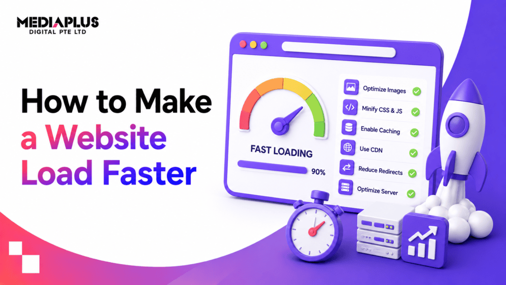
Speed is now a ranking factor and a conversion factor at the same time. Google’s Core Web Vitals set specific, measurable targets that a “good” page should meet for at least 75 percent of visits (Google, 2024).
- Largest Contentful Paint (LCP): 2.5 seconds or faster.
- Interaction to Next Paint (INP): 200 milliseconds or less (INP replaced First Input Delay as a Core Web Vital in March 2024).
- Cumulative Layout Shift (CLS): 0.1 or less.
|
Do |
Don’t |
|
Serve images in modern formats (WebP or AVIF) and lazy-load below the fold |
Upload full-resolution PNGs straight from the camera |
|
Reserve space for images and ads to prevent layout shift |
Let the page jump around as elements load in |
|
Minify CSS and JavaScript and defer non-critical scripts |
Stack ten third-party scripts and plugins you never audit |
|
Use a CDN and caching |
Host everything on one slow shared server |
|
Measure with PageSpeed Insights and real-user data |
Guess at speed by how fast it feels on your own fast connection |
Our full breakdown of Core Web Vitals explains how to diagnose and fix each metric.
SEO basics
You can have a beautiful site that no one finds. On-page SEO fundamentals make sure search engines can crawl, understand and rank your pages. None of this is exotic; it is mostly discipline.
|
Do |
Don’t |
|
Give every page a unique title tag and meta description |
Leave duplicate or auto-generated titles across pages |
|
Use one H1 per page and a logical heading structure |
Skip heading levels or use them just for styling |
|
Write descriptive, keyword-aware URLs and alt text |
Stuff keywords unnaturally into copy and tags |
|
Add internal links between related pages |
Orphan pages with no links pointing to them |
|
Submit an XML sitemap and fix crawl errors |
Block important pages in robots.txt by accident |
Accessibility (WCAG 2.2 AA)
Accessibility is both an ethical baseline and, increasingly, a legal one. In Australia, the Disability Discrimination Act 1992 applies to websites, and public sector sites are held to the Web Content Accessibility Guidelines. WCAG 2.2 became the W3C recommended standard in October 2023, and AA is the level most organisations aim for. An accessible site is also easier for everyone to use.
|
Do |
Don’t |
|
Keep text contrast at 4.5:1 or higher against its background |
Put light grey text on a white background |
|
Add descriptive alt text to meaningful images |
Leave alt attributes empty on informative images |
|
Make every function usable by keyboard alone |
Trap keyboard users in a menu or modal they cannot exit |
|
Label form fields properly and link errors to their field |
Rely on colour alone to signal a required field or an error |
|
Use real headings and semantic HTML |
Fake structure with bold text and manual spacing |
Forms and CTAs
The form is where a browsing visitor turns into a lead. Every extra field is a reason to leave. Baymard Institute research on checkout forms found the average checkout can be reduced to around eight fields, roughly half of what most sites use.
|
Do |
Don’t |
|
Ask only for the fields you genuinely need |
Demand phone, company and address to download a PDF |
|
Use one clear primary call to action per page |
Surround the button with five competing links |
|
Write action-specific button text (“Get my quote”) |
Label every button “Submit” or “Click here” |
|
Show inline validation and a clear success message |
Reset the whole form when one field is wrong |
|
Make the CTA visually distinct and repeated on long pages |
Hide the only button below the fold in a muted colour |
Trust and security
People will not hand over a card number, or even an email, to a site that feels unsafe. Trust signals and basic security are conversion features, not just IT chores.
|
Do |
Don’t |
|
Serve the whole site over HTTPS with a valid certificate |
Run any page, especially checkout, on plain HTTP |
|
Show real reviews, logos, guarantees and an ABN |
Fake testimonials or use stock “5 stars” with no name |
|
Publish a clear privacy policy and contact details |
Hide who you are behind a form-only contact page |
|
Display security and payment badges near the checkout |
Ask for payment on a page with no visible reassurance |
|
Keep the CMS, plugins and themes patched |
Leave known vulnerabilities open for months |
Maintenance
A website is not a one-off project; it is a living thing that decays without attention. Broken links, outdated content and un-patched plugins accumulate quietly until something breaks in public.
|
Do |
Don’t |
|
Run scheduled backups you have actually tested restoring |
Assume your host has a backup until you need it |
|
Update the CMS, plugins and dependencies on a schedule |
Leave everything auto-updating with no monitoring |
|
Check for broken links and fix 404s regularly |
Let dead links and orphaned pages pile up |
|
Review analytics and content freshness each quarter |
Publish once and never look at the page again |
|
Keep a staging site for testing changes |
Edit live and hope nothing breaks |
Launching cleanly sets the tone for all of this. Our website go-live checklist covers the final pass before you publish, and for WordPress builds specifically, our WordPress website development team handles the ongoing patching and hardening.
The short version: top 5 dos and top 5 don’ts
If you only remember ten things from this guide, make it these.
Top 5 dos
- Design mobile-first and test on real phones.
- Hit the Core Web Vitals targets (LCP under 2.5s, INP under 200ms, CLS under 0.1).
- Keep navigation to a handful of plainly labelled items.
- Meet WCAG 2.2 AA contrast and keyboard basics.
- Cut every form down to the fields you truly need.
Top 5 don’ts
- Don’t bury your call to action or dilute it with competing links.
- Don’t upload huge unoptimised images.
- Don’t use script or display fonts for body text.
- Don’t run checkout or forms on non-HTTPS pages.
- Don’t launch and forget; broken links and stale plugins cost you rankings and trust.
Frequently asked questions
What are the most important website dos and don’ts for a small business?
Start with speed, mobile and a clear call to action. A fast, mobile-friendly page with one obvious next step will out-convert a beautiful but slow site every time. After that, fix navigation and trust signals like reviews and an HTTPS padlock.
How many colours and fonts should a website use?
As a rule of thumb, stick to two or three brand colours plus neutral greys, and no more than two typefaces (one for headings, one for body). Consistency reads as credibility; variety for its own sake reads as amateur.
Do Core Web Vitals really affect my Google ranking?
Yes. They are a confirmed Google ranking signal as part of the page experience system. They rarely outweigh strong, relevant content, but between two similar pages the faster, more stable one has the edge. Meeting the “good” thresholds also lowers your bounce rate regardless of ranking.
What does WCAG 2.2 AA mean in practice?
It is the accessibility standard most Australian organisations aim for. In practice it means readable colour contrast (4.5:1 for normal text), full keyboard operability, properly labelled forms, and descriptive alt text. It benefits every visitor, not only those using assistive technology.
How often should I update or maintain my website?
Apply security and plugin updates monthly at least, review content and analytics quarterly, and run a full technical check (links, speed, forms) twice a year. Backups should run automatically and be tested periodically so you know a restore actually works.
How many fields should a contact form have?
Only the ones you will actually use. For a lead form, name and email plus one qualifying question is usually enough. Every additional field lowers completion, so if a field will not change how you respond, cut it.
Should I fix my current site or rebuild it?
If the problems are content, speed and a few layout fixes, improving the existing site is usually the better value. If navigation, structure and mobile experience are all fighting you, a rebuild on modern foundations often costs less over two years than patching an old one.
Getting the fundamentals right
None of these dos and don’ts are difficult on their own. The hard part is doing all of them, consistently, across every page, and keeping them true as the site grows. That is the work: not chasing the newest trend, but getting the basics right and keeping them right.
If you would like a second pair of eyes on where your site sits against this checklist, the MediaPlus Digital web design team in Melbourne can audit it and map out the fixes worth making first. And if search visibility is the goal, pairing a clean build with our SEO service turns a well-built site into one people can actually find.