
Your website is not just a digital brochure. It is your first impression, your credibility check, and often your strongest sales asset.
Users form an opinion about your website in less than a second. If something feels slow, confusing, outdated, or hard to use, they leave. Not later. Immediately.
With millions of websites competing for attention, small design mistakes can quietly destroy trust, rankings, and conversions. Many businesses lose customers not because their offer is weak, but because their website gets in the way.
Below are the most damaging website design mistakes businesses make today, combining usability research, SEO best practices, and real-world performance data, plus clear guidance on how to fix them.
1. Slow Website Loading Speed
Speed is no longer a nice-to-have. It is a baseline expectation.
A one-second delay in page load time can reduce conversions by around 7 percent. Slow websites frustrate users, increase bounce rates, and hurt search rankings because Google directly factors page speed into its algorithm.
Speed issues usually come from heavy images, poor hosting, excessive scripts, or outdated build practices.
How to fix it
-
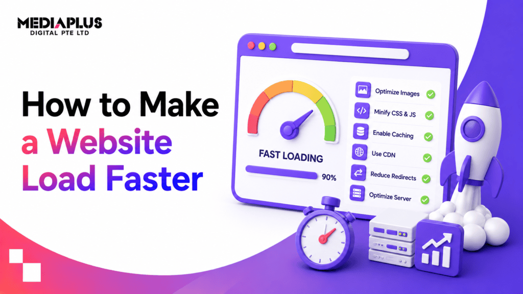
Compress and optimise images without sacrificing quality
-
Reduce unnecessary JavaScript and CSS files
-
Enable browser caching
-
Use a content delivery network to serve users faster based on location
-
Invest in reliable, performance-focused hosting
Fast websites feel professional. Slow ones feel broken.
2. Poor Mobile Experience
Most users visit your site on a phone. If your website does not work well on mobile, you are turning away more than half your audience.
Mobile-unfriendly websites lead to higher bounce rates, lower trust, and weaker SEO performance. Google now evaluates your site primarily from a mobile-first perspective.
Common issues include text that is too small, buttons that are hard to tap, layouts that break, and mobile pages that load slowly.
How to fix it
-
Use responsive design that adapts to all screen sizes
-
Test your site on real devices, not just desktop previews
-
Ensure buttons and links are easy to tap
-
Prioritise mobile speed with lazy loading and clean code
Mobile optimisation is not an add-on. It is the foundation.
3. Confusing Navigation and Site Structure
If users cannot find what they need quickly, they leave. They do not explore. They do not ask for help. They just exit.
Overloaded menus, vague labels, and poorly structured pages create friction and frustration. Navigation should guide users, not challenge them.
How to fix it
-
Limit main navigation to essential sections
-
Use clear, descriptive labels instead of generic terms
-
Organise content logically with a clean hierarchy
-
Add breadcrumbs for clarity on larger sites
-
Include a simple, effective search function if content is extensive
Good navigation feels invisible. Bad navigation is impossible to ignore.
4. Weak or Missing Calls to Action
Traffic alone does not grow a business. Action does.
Many websites fail because they do not clearly tell users what to do next. Weak calls to action confuse visitors and kill conversions.
Buttons like “Submit” or “Learn More” lack motivation and clarity. Placement also matters. If users have to search for the next step, you have already lost them.
How to fix it
-
Use action-driven language that communicates value
-
Make CTAs visually distinct and easy to spot
-
Place CTAs above the fold and repeat them naturally
-
Test different wording, colours, and placements
Strong CTAs turn interest into outcomes.
5. Outdated or Inconsistent Design
Design signals trust before a single word is read.
Outdated visuals, low-quality images, or inconsistent branding make a business feel unreliable. Users often judge credibility subconsciously based on visual polish alone.
Design trends evolve, but clarity, consistency, and quality never go out of style.
How to fix it
-
Refresh design every few years to stay current
-
Use high-quality images instead of generic stock photos
-
Keep colours, typography, and spacing consistent
-
Design with accessibility in mind, including contrast and readable fonts
Professional design builds confidence. Poor design raises doubt.
6. Using Images Instead of Real Text
Search engines cannot read text embedded inside images. Users with accessibility needs cannot either.
Important content hidden inside images hurts SEO, accessibility, and clarity.
How to fix it
-
Use real HTML text for headings and key information
-
Add descriptive alt text to images
-
Use images to support content, not replace it
Text should carry meaning. Images should enhance it.
7. Poor Readability and Content Structure
Walls of text drive users away.
People scan online content. If your site is difficult to read, users will not engage, no matter how good your offer is.
How to fix it
-
Break content into short paragraphs
-
Use headings, bullet points, and clear sections
-
Highlight key phrases naturally
-
Write plainly and avoid unnecessary jargon
Scannable content respects the user’s time.
8. Ignoring Basic SEO and Page Structure
Design and SEO are not separate. They work together.
Missing page titles, unclear URLs, poor internal linking, and hidden information reduce visibility and usability at the same time.
How to fix it
-
Write clear, descriptive page titles
-
Use clean, readable URLs with hyphens
-
Structure pages logically for users and search engines
-
Answer key user questions clearly, including pricing where relevant
If users cannot find answers, they assume you do not have them.
Final Thoughts
Most website failures are not dramatic. They are subtle.
A slow load time. A confusing menu. A weak call to action. An outdated look. Each one quietly pushes users away.
Avoiding these mistakes does more than improve design. It improves trust, engagement, and conversion performance.
Your website should work as hard as your business does.
Need Help Fixing These Issues?
If your website feels slow, outdated, or underperforming, it may be time to rethink how it is built.
A professional website design and development service focuses on performance, usability, and long-term growth, not just visuals.
You can explore how MediaPlus Digital Australia approaches modern, conversion-focused web design and development here.
A better website is not about trends. It is about removing friction and helping users take action.